Monthly Archives: March 2020

Phil 3.31.2020

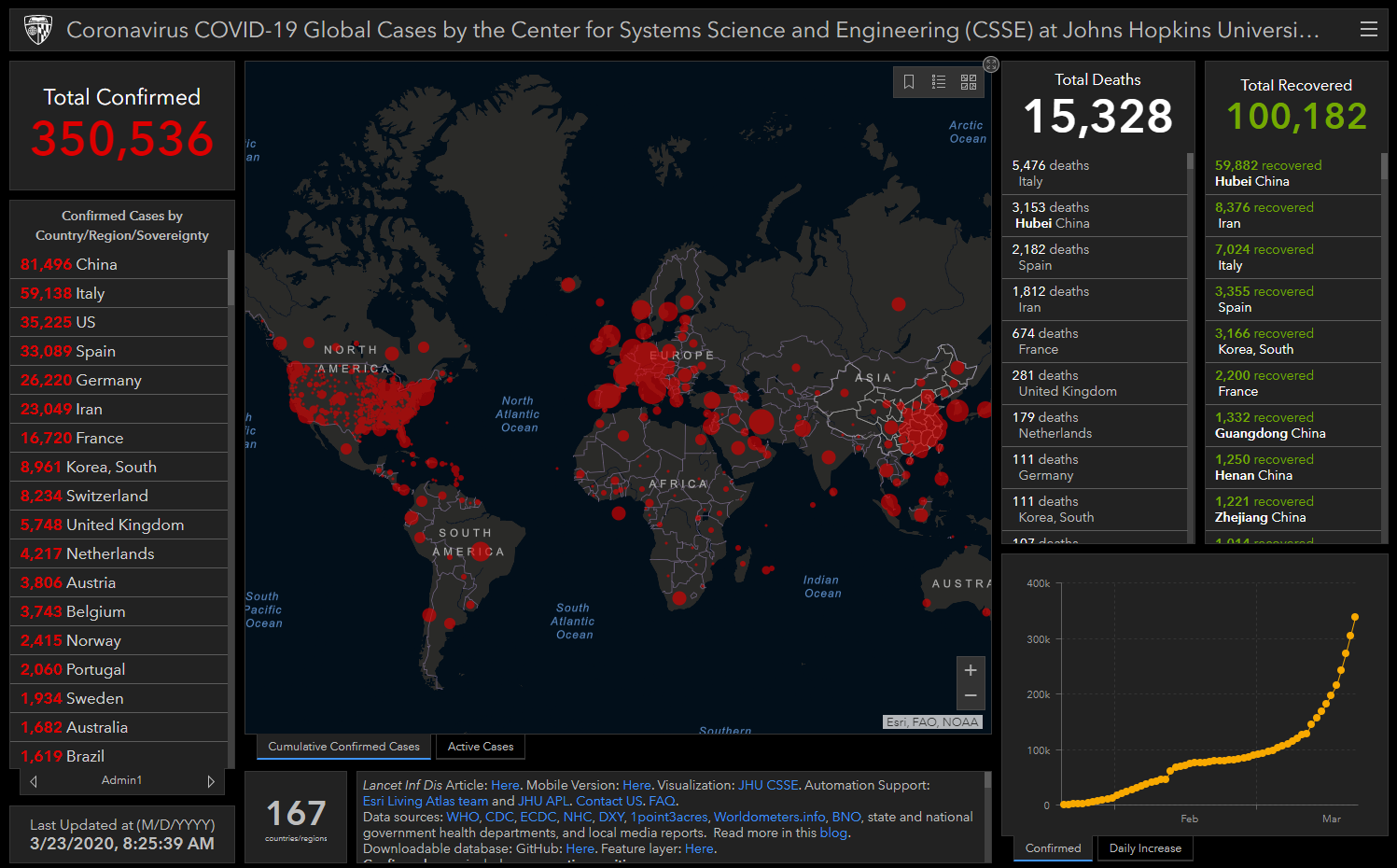
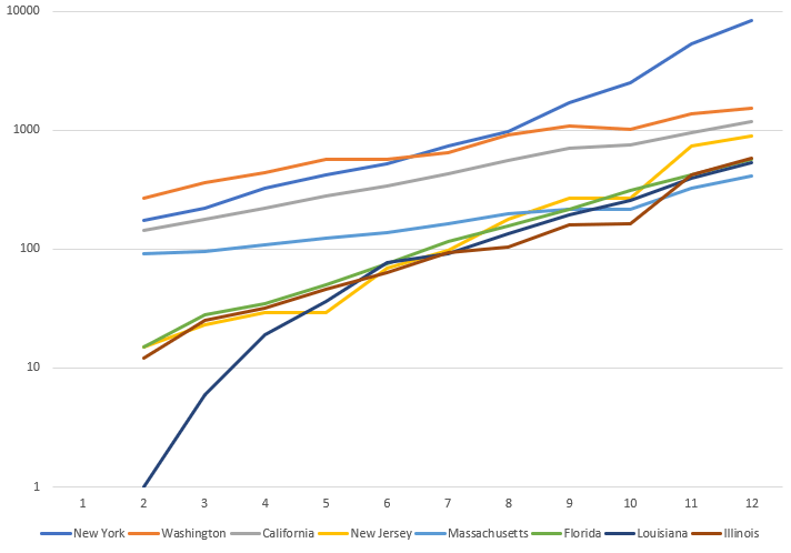
I need to go grocery shopping today. A friend of mine has come down with the virus. He’s in his 30’s, and I’m feeling vulnerable. I went down to the shop and dug up my painting masks. Turns out I have a few, so that’s what I’m going shopping with. Here’s why, from the NY Times:

When researchers conducted systematic review of a variety of interventions used during the SARS outbreak in 2003, they found that washing hands more than 10 times daily was 55 percent effective in stopping virus transmission, while wearing a mask was actually more effective — at about 68 percent. Wearing gloves offered about the same amount of protection as frequent hand-washing, and combining all measures — hand-washing, masks, gloves and a protective gown — increased the intervention effectiveness to 91 percent.

Podcast with BBC’s misinformation reporter: https://podcasts.apple.com/gb/podcast/the-political-party/id595312938?i=1000470048553


  • A friend of mine who works in Whitehall has told me that the army are going to be on the streets this week arresting people who don’t listen to this podcast. If that sounds familiar, you’ll be aware that this crisis has already been fertile ground for disinformation. Marianna Spring is a BBC specialist reporter covering disinformation and social media. In this fascinating interview, Marianna reveals how disinformation and misinformation gets so widely shared, why we share it, how to spot it, what the trends are, how it differs around the world and so much more. This is a brilliant insight not just into the sharing of inaccurate information, but into human behaviour.


D20

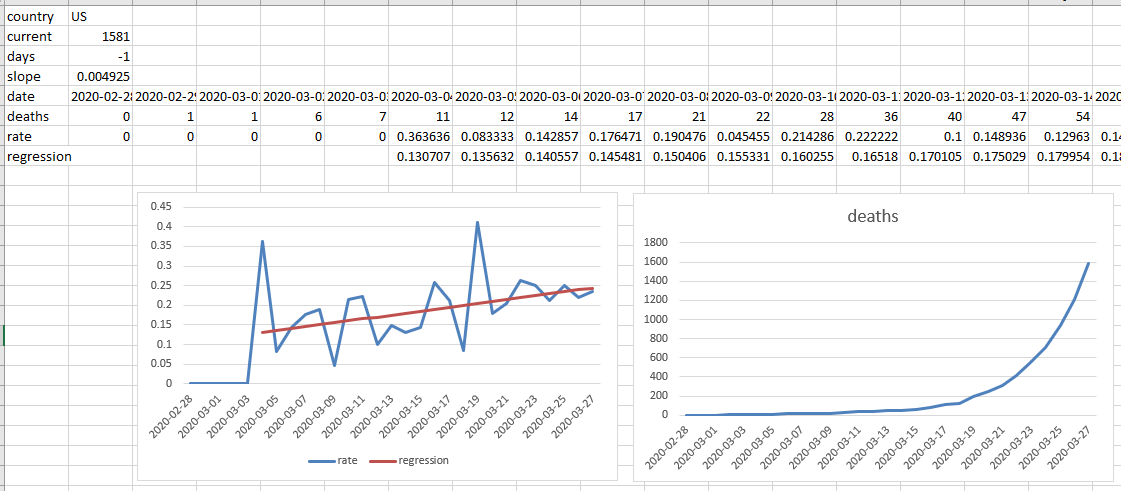
  • Changed the calculations from the linear regression to handle cases where the virus is under control, like China – first pass is done
  • Have the linear regression only go back some number of weeks/months. I’m worried about missing a second wave
  • Need to add a disclaimer about the quality of the predictions is dependent on the quality of the data, and that we expect that as poorer countries come online, these trends may be erratic and inaccurate.
  • Add an UNSET state. The ETS will only set the state if it is UNSET. This lets regression predictions to be used until the ETS is working well – done
  • I think showing the linear and ETS mean prediction is a good way to start including ETS values
  • Found the page that shows how to adjust parameters: https://www.statsmodels.org/stable/examples/notebooks/generated/exponential_smoothing.html

GOES

  • Try to create an image from the stored tar
  • Start setting up InfluxDB2

IRAD Meeting at 2:00

ML Group at 4:00

  • Put together a list of potential papers to present. No need, I’ll do infinitely wide networks
  • Had just a lovely online evening of figuring out how to use some (terrible!) webex tools, and trying to figure out Neural ODEs. It was an island of geeky normalcy for a few hours. This may be a more comprehensible writeup.

Phil 3.30.20

Today’s study in contrasts: Italy and the US:

COVID-19 projections for the US, from the The Institute for Health Metrics and Evaluation (IHME):

IHME

Work on converting the ETS json file into spreadsheets to evaluate thresholds and labels – spreadsheet conversion is working. done! Now I need to figure out what those ETS parameters do!

Add a short bit to the D20 writeup that explains why linear interpolation isn’t the best option, and why we went with ETS – done

Work with Zach to get the website up today – working

Work this article into the exploit-space writeup: Why Is Cybersecurity Not a Human-Scale Problem Anymore?. Wow, actually, the company (Balbix) that was founded by the author (Gaurav Banga) seems to be doing most of what I was going to write about. Sent Darren a note to see if I should continue

Got a note from ProQuest saying my file needed to have blank pages at the beginning and end of the document. Fixed. And accepted!

  • Congratulations. Your submission, xxxxx has cleared all of the necessary checks and will soon be delivered to ProQuest for publishing.

Ok, back to Docker and building an InfluxDB image. Wow, that seems like a lifetime ago I was doing this

  • To save a custom image, create the container from a base image and then docker save image_name > image_name.tar. This puts it wherever you run the command in the system, Linux or Windows

#COVID-19 meeting at 1:30 today – proposal’s in. We have twitter data from January

SDaaS meeting at 4:00 today – postponed

Phil 3.28.20

From today’s spreadsheet: countries_2020-03-28_07-38

US_3.28_2020

Italy_3.28_2020

NY Times is starting to use rates as well Some U.S. Cities Could Have Coronavirus Outbreaks Worse Than Wuhan’s

Interesting chat as an expert(?) on developing code in the future

Working on the ssh transfer in code using paramiko. This seems to be a good one.

It works!

import paramiko

filename = "C:/Development/Sandboxes/DaysToZero/data/external/countries_2020-03-28_07-38.xlsx"
remote_dir = "/home/some_place.com/d20/countries_2020-03-28_07-38.xlsx"
client = paramiko.SSHClient()
client.set_missing_host_key_policy(paramiko.AutoAddPolicy())
client.connect('ssh.some_place.com', username='some_login', password='some_password')
ftp_client = client.open_sftp()
#l = ftp_client.listdir()
#print(l)
ftp_client.put(filename, remote_dir)
ftp_client.close()
client.close()

I should try to put all the pieces together, but I am just done, and am stress-scrolling through Twitter, which really doesn’t help. Getting away from the computer for a while

Phil 3.27.20

Working with Zach and Aaron on the app. I think we’ll have something by this weekend

  • Added a starting zero on the regression
  • Added the regression to the json file, and posted to see if Zach can reach
  • Set up the hooks for export to excel workbook, with one tab per active country. I’ll work on that later today – done! countries

Got clarification from Wayne on some edits. Going to turn those around this morning and try to submit before COB today. Maryland is at 580 confirmed cases as of yesterday. I’d expect to see nearly 800 when they update the site this morning. Sent over all the edits. It’s in!

Maryland_3.26_2020

Yup

Maryland_3.27_2020

ProQuest submission site.

Phil 3.26.20

Updated the proposal

Found an example of diversity injection in the wild: the-syllabus.com. Here’s a story about it from The Correspondent.

Working on the parser today

  • Tried using my ExcelUtils, which are barfing on all the text in the csv
  • Discovered DictReader from the csv library, which works perfectly!
  • Throwing away rows that have less than three data points
  • Collecting rows into countries – done
  • Parsing out dates and values – done
  • Working on getting totals – done
  • Working on calculating rates – done
  • Seeing if I can do a least squares regression to calculate a first pass -done? It doesn’t seem to quite work right on the actual data
  • Aaron added his pieces in and everything seems to be kind of working

Phil 3.25.20

Waking up to the news these days makes me want to stay in bed with the radio off

Working on automating the process of downloading the spreadsheet, parsing out the countries, and calculating daily rates. The goal is to have a website up this weekend so you can see how your country is doing.

Tasks

  • Set up converter class – done
  • download spreadsheet – done
  • parse out countries – working on it
  • Made mockups of the mobile and webpage displays, and refined a few times based on comments

Got notes for Chapter 11 from Wayne. Switching gears and rolling that in. Put in changes for all the items I could read. There are a few still outstanding. I’ll submit tonight if Wayne doesn’t come back for a discussion.

Back to Docker. Need to connect to the WLS. Done!

Meetings

  • AIMS – status for all, plus technichal glitches. We’ll try Teams next time. Vadim has made GREAT progress. We might be able to get a real Yaw Flip soon as well
  • A2P – Infor demo. Meh.

Stampede theory proposal deadline was delayed a couple of days

Phil 3.24.20

Well, I’ve got more predictions using death rates as described in this post. Based on the latest dataset from here (Github), I’ve created a spreadsheet that does a linear (least squares) extrapolation for when the number of new deaths per day drops to zero:

predictions_3.24.20

China is in this group as a sanity check, and as you can see, it’s very near zero, and so is South Korea. Italy, Germany, Spain, Iran, and Indonesia are currently all in the middle, with 2-3 weeks to go if nothing changes. France, the Netherlands, and Switzerland are far enough out that I think these may be low confinance values. The UK seems to be doing terribly. The worst performers are Belgium and the US, whose death rates are still going up, as indicated by the “-1” in the “days till” column.

Here are plots of the data used to calculate the table. Due to the way that excel labels axis, I don’t have dates for the x-axis for all the charts. They all end on the seme date (3/21, the last day in the dataset with the two days I need to calculate rates), but some of them have fewer tata points so that the time before the outbreak doesn’t influence the calculations:

prediction_charts_3.24.20

Working on Hours for misinfo proposal

ASRC

  • Had a good chat with Biruh about InfluxDB running in Docker. Since I’m running the Windows version, things are different enough that I’m going to need to download a linux distro image and run my own version of InfluxDB2 inside that. Which means I need to get smarter on Docker and making a custom image, etc. Got this book. We’ll see how that goes today.

ML Webex meeting

BART is the new BERT!

BART

Phil 3.23.20

I think I found a way of looking at COVID-19 data in a way that makes intuitive sense to me – growth rate. Let’s revisit the scary dashboard:

This is a very dramatic presentation of information, and a good way of getting a sense of how things are going right now, which is to say, um… not well.

But if we look at the data (from here), we can break it down in different ways. I’m going to focus on the daily death rate. In other words, what is the percentage of deaths from one day to the next?

These still look horrible, but they do not appear to be getting worse. The curves are flattening. What happens if we look at the same data as a rate problem though?

That looks very different. After a big initial spike, both countries have a rate of decrease that fits pretty well to a linear trend. So what do we get if we plug the current rate of increase in and solve for zero? In other words, when are there no more new cases?

Italy’s current rate is 11.89%, or 0.1189. Iran is 7.66% or 0.0766. Using those values we get some good news:

  • Italy: 27 days, or April 19th
  • Iran: 15 days, or April 7th

Ok, so let’s look at the US. There’s not really enough data to do this on a state-by state basis yet, but there is plenty for the whole country:

This is not good. Our rate of increase is more than either Iran’s or Italy’s rate of decrease. At this point, there is literally no end in sight.

Ok, let’s look at the world as a whole:

Also not good. Things clearly improved as China got a handle on its outbreak, but the trends are now going the other way as the disease spreads out into the reset of the world. It’s clearly going to be a bumpy ride.

I’d like to point out that there is no good way to tell here what caused these trends to change. It could be treatments, or it could be susceptibility. Italy and Iran did not take the level of action that China did, yet if trends continue, they will be clear in about a month. Well know more as the restrictions loosen, and there is or isn’t a new upturn.

Ok, Back to work

10:00 – ASRC GOES

  • Getting InfluxDB to work in Docker
  • Use cases for John and whitepaper for Darren?
  • Noon research Meeting
  • 4:00 ML seminar?

Phil 3.22.20

Meme’s in the early days of COVID-18: Coronavirus Goes Viral: How Online Meme Culture Reflects Our Shared Experience Of A Global Pandemic

Downloading and looking at data. I think an easy thing to do with the confirmed vs death rates is to train a confirmed sequence to predict death rates and maybe also classify using country tags?

Need to write up a stampede theory approach to identifying misinformation for the proposal. Something about that our lives have suddenly become even more online. Maybe training ML systems to detect relative clustering patterns of term embeddings over time. Like, take the centroid of a topic, re-center and look for patterns.

Phil 3.21.20

No analytics today, but I found this site: healthweather.us. It’s a project from Oregon State that uses data from IoT thermometers to look up anomalously high temperatures (the light gray is for no data):

Ok, so that made me download some data and compare data. This is the confirmed cases file from here: data.humdata.org/dataset/novel-coronavirus-2019-ncov-cases

I’m not sure if these are statistically different rates of increase (more later), but Washington, Massachusetts, and California don’t seem to be increasing as fast as the other states? Florida, Louisiana, Illinois, and New Jersey are very much in the same population though. It’s looking at linear scales too. It is very clear that all these trends are really just getting started.

Lastly, here’s a good video that places COVID-19 on the context of other pandemics. I’m not convinced that it has all the numbers right, but it matches the numbers I do know:

Phil 3.20.20

Yesterday, I looked at the confirmed cases from this dataset. Today, I thought I’d look at the death rates. These are actually from yesterday. Maybe I’ll update at the end of the day. Everything is in a logarithmic scale because it’s impossible to tell the difference between one crazy exponential rate and another (It may be small-world power law as well, as per here). This is also with China excluded:

I mean, that’s not a good picture. I can see why California went on full non-essential lockdown today – we seem to be on the same trajectory as Iran, assuming the difference in slope is not related to manipulated or poorly-gathered information. South Korea, as per reports, really has appeared to adjust the trajectory. Note though, that the adjusted curve still seems to be exponential, but at a lower value.

My sense right now is that the economic impacts (however those would be charted) are going to look similar, with some kind of time delay that relates to spare capacity, like savings. My sense is that this is going to be bigger than the 2008 financial meltdown, but maybe in some kind of slow motion?

Since I can work from home, and work on government contracts, I’ve been sending money to food banks and similar charities. Hopefully, the best ways to contribute will become clear as the situation settles into the new “normal”. For some more thinking on the economic impact, there’s a short interview with John Ioannidis, who wrote in this article:

One of the bottom lines is that we don’t know how long social distancing measures and lockdowns can be maintained without major consequences to the economy, society, and mental health. Unpredictable evolutions may ensue, including financial crisis, unrest, civil strife, war, and a meltdown of the social fabric. 

“A fiasco in the making? As the coronavirus pandemic takes hold, we are making decisions without reliable data” – StatNews, 3/17/2020

I tend to agree that the world at large is focusing on one, large immediate problem when it needs to be focusing on two large immediate problems. And that’s probably too much to expect.

8:00 – 4:30 ASRC GOES

  • More interesting use of ML to enhance simulations: NeRF: Representing Scenes as Neural Radiance Fields for View Synthesis
    • We present a method that achieves state-of-the-art results for synthesizing novel views of complex scenes by optimizing an underlying continuous volumetric scene function using a sparse set of input views. Our algorithm represents a scene using a fully-connected (non-convolutional) deep network, whose input is a single continuous 5D coordinate (spatial location (x,y,z) and viewing direction (θ,ϕ)) and whose output is the volume density and view-dependent emitted radiance at that spatial location. We synthesize views by querying 5D coordinates along camera rays and use classic volume rendering techniques to project the output colors and densities into an image. Because volume rendering is naturally differentiable, the only input required to optimize our representation is a set of images with known camera poses. We describe how to effectively optimize neural radiance fields to render photorealistic novel views of scenes with complicated geometry and appearance, and demonstrate results that outperform prior work on neural rendering and view synthesis. View synthesis results are best viewed as videos, so we urge readers to view our supplementary video for convincing comparisons.
  • Let’s see if we can get InfluxDB working in Docker and start to generate and store data
  • I found a wonderful thing! It looks like you can change the default settings for where applications and their data are saved! Here’s a screenshot of where in the settings:

Phil 3.19.20

I found the data sources for the dashboard in the previous few posts. Yes, everything still looks grim:

So rather than working on my dissertation, I thought I’d take a look at the data for the last 9(!) days in Excel:

This is for the USA. The data is sorted based on the cumulative total of new cases confirmed. If you look at the chart on the right, everything is in line with a pandemic in exponential growth. However, that’s not the whole story.

I like to color code the cells in my spreadsheets because colors help me visualize patterns in the data that I wouldn’t otherwise see. And one of the things that really stands out here is the red rows with one yellow cell on the left. These are all cases where the rate of confirmed new cases dropped to zero overnight. And they’re not near each other. They are in WA, NY, and CA. Is this a measuring problem or is something going right in these places?

Maybe we’ll find out more in the next few days. Now that I know how to get the data, I can do some of my own visualizations that look for outliers. I can also train up some sequence-to-sequence ML models to extrapolate trends.

One more thing. I had heard earlier (Twitter, I think?) that Vietnam was handling the crisis well. And it looks like it was, but things are back to being bad:

Ok, back to work

8:00 – 4:30 ASRC PhD, GOES

  • Working on the process section – done!
  • Working on the TACJ bookend – done! Made a new figure:
  • Submitted to Wayne. Here’s hoping it doesn’t fall through the cracks
  • Neuroevolution of Self-Interpretable Agents
    • Inattentional blindness is the psychological phenomenon that causes one to miss things in plain sight. It is a consequence of the selective attention in perception that lets us remain focused on important parts of our world without distraction from irrelevant details. Motivated by selective attention, we study the properties of artificial agents that perceive the world through the lens of a self-attention bottleneck. By constraining access to only a small fraction of the visual input, we show that their policies are directly interpretable in pixel space. We find neuroevolution ideal for training self-attention architectures for vision-based reinforcement learning tasks, allowing us to incorporate modules that can include discrete, non-differentiable operations which are useful for our agent. We argue that self-attention has similar properties as indirect encoding, in the sense that large implicit weight matrices are generated from a small number of key-query parameters, thus enabling our agent to solve challenging vision based tasks with at least 1000x fewer parameters than existing methods. Since our agent attends to only task-critical visual hints, they are able to generalize to environments where task irrelevant elements are modified while conventional methods fail.

Phil 3.18.20

7:00 – 5:00 ASRC GOES

Today’s dashboard snapshot (more data here). My thoughts today are about supression and containment, which are laid out in the UK’s Imperial College COVID-19 report. The TL;DR is that suppression is the only strategy that doesn’t overwhelm healthcare. Suppression is fever clinics, contact tracing, and enforced isolation, away from all others (in China, this was special isolation clinics/dorms). This has clearly worked in China (and a town in Italy), though Hong Kong and Singapore seem to be succeeding in different (more cultural?) ways. The thing that strikes me is that suppression is just putting a lid on things. The moment the lid comes off, then infections start up again? I guess we’ll see over the next few months in China.

There appear to be vaccines in (human already!) testing. Normally, there is an extensive evaluation process to see if the treatment is dangerous, but that was sidestepped during the AIDS crisis (the parallel track policy). I wonder if at risk populations (People older than 70?), will allowed to use less-tested drugs. My guess is yes, probably within a month.

  • Finished all the dissertation revisions and made a document that contains only those revisions. Need to make a change tableand then send (full and revisions only) to Wayne today.
    • Whoops! No I didn’t. After putting together the change table, I realize there are still a few things to do. Dammit!
  • Update SDaaS paper as per John’s edits
  • Phone call with Darren at 2:00
    • Start a google doc that has all the parts of a proposal, plus a good introduction.
    • Also the idea of sims came up again as ways to define, explain, train ML, and test a problem/solutions
  • AIMS meeting at 3:00

Phil 3.17.20

7:00 – ASRC PhD/GOES

Today’s view of the dashboard. Looking at the numbers, it’s pretty clear that China has things under control, which means that we can get an idea of what it will look like in the US on the other side. The symptomatic population was (3,111 deaths + 55,987 recovered) = 59,098. That means that the mortality rate for that (infected? symptomatic?) population (59,098/3,111) is 5.26%. The median age in China is 38.4 years. Interestingly, that’s about the same as the USA.

So, if you know 20 people who come down with symptoms, it looks like one probably won’t make it? The CDC says that between 160 million and 214 million people in the United States could be infected over the course of the epidemic. So that works out to 8.5M – 11.2M fatalities? That seems really high. For a comparison, cancer and heart disease kill roughly 1.2M/year in the US.

In a fit of unbridled optimism, I’m booking vacation flights for September – done! Got to use my cancelled TF Dev tix

  • Ok, back to finishing the dissertation. Boy, it is hard to concentrate.
    • Conclusions are done
    • Working on tying things back to the literature

Phil 3.16.20

7:00 – 5:00 ASRC PhD/GOES

  • Working from home for the duration of the COVID-19 pandemic. It’s estimated that we are approximately 10 days behind Italy, So I’m hoping that when things start to get better there, it will be a head’s up that things might start to get better here.

(Via Corriere delle Sera)

  • Needless to say, things are not getting better there yet.
  • So, before the university gets to the point where it can’t handle the submission of the dissertation, I’m going to work on getting the revisions done and submitted.
    • Finished first pass through Limitations and Research chapter
    • Tried to start on fixing the conclusions but ran out of motivation
  • #COVID-10 meeting at noon –
    • Set up folders for lit, assets, software and data
    • Started a rough draft of the (chi 2021?) paper
  • Write BSO about moving Mahler to Bach/Radiohead – done
  • Started to work through the SDaaS paper with John D.
  • From models of galaxies to atoms, simple AI shortcuts speed up simulations by billions of times
    • Modeling immensely complex natural phenomena such as how subatomic particles interact or how atmospheric haze affects climate can take many hours on even the fastest supercomputers. Emulators, algorithms that quickly approximate these detailed simulations, offer a shortcut. Now, work posted online shows how artificial intelligence (AI) can easily produce accurate emulators that can accelerate simulations across all of science by billions of times.

John’s Hopkins gets dashboard of the day