7:00 – 8:00 Research
- Continuing Online clustering, fear and uncertainty in Egypt’s transition. Notes are here
- Transitions from Authoritarian Rule
- Political science scholars consider the four-volume work Transitions from Authoritarian Rule to be a foundational text for studying the process of democratization, specifically in those cases where an authoritarian regime is giving way to some form of democratic government. The most important of the four books is without a doubt the fourth volume, Tentative Conclusions about Uncertain Democracies, also known as “the little green book.”Transitions from Authoritarian Rule was the first book in any language to systematically compare the process of transition from authoritarianism across a broad range of countries. Political democracy is not the only possible outcome. Guillermo O’Donnell, Philippe C. Schmitter, and Laurence Whitehead emphasize that it’s not the revolution but the transition that is critical to the growth of a democratic state. This ground-breaking insight remains highly relevant as the ramifications of the Arab Spring continue to play out.
- The Politics of Uncertainty: Sustaining and Subverting Electoral Authoritarianism (Oxford Studies in Democratization)
- HR-diagrams are a great example of a behavior map. I think I would even contend that a map can be defined as a diagram that supports the plotting of trajectories

- A self-organizing semantic map for information retrieval
- Computer method and system for topographical representation of textual data (patent – could be a problem for the ResearchBrowser?)
- When Deceitful Chats Look Truthful (Self organizing maps!)
- Fear and Loathing across Party Lines: New Evidence on Group Polarization
- Prior Exposure Increases Perceived Accuracy of Fake News
8:30 – 2:30 BRC
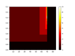
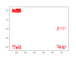
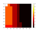
- Got the reducers in, now I need to colorize the original df for display. Done. The results aren’t great though. Below are results for isomap:
The images show
- The XY positions of the reduced data. I’ve added a bit of jitter so it’s possible to see all the points. They should be pretty evenly distributed, but as you can see, the lower right has a much greater population.
- This is backed up by the color mapped images of the original clusters, were the majority of the rows are black, and the other values are all in the bottom-right square
- The 3D fitness landscape made via subsurface shown in 3D
- and in 2D
-
- A roughly similar run (and yes, they vary a lot!) is shown with a brute-force (naive)surfacer. Actually, it may makes sense to use the naive surfacer on the reduced data since it’s so much faster:
-